Have you ever spent hours arranging artwork on your wall, only to step back and feel like something’s just… off? You’re not alone. As an interior designer with over a decade of experience, I’ve seen countless homeowners make the same critical errors when creating their dream gallery walls. The good news? These mistakes are completely avoidable once you know what to look for.
Gallery walls have become the ultimate statement piece in modern home decor, transforming blank spaces into captivating focal points that reflect your personality and style. But here’s the truth that most people don’t realize: the difference between a amateur-looking wall and a professionally curated masterpiece often comes down to just a few key principles that anyone can master.
1. The Spacing Trap: Why Most Gallery Walls Look Chaotic Instead of Cohesive
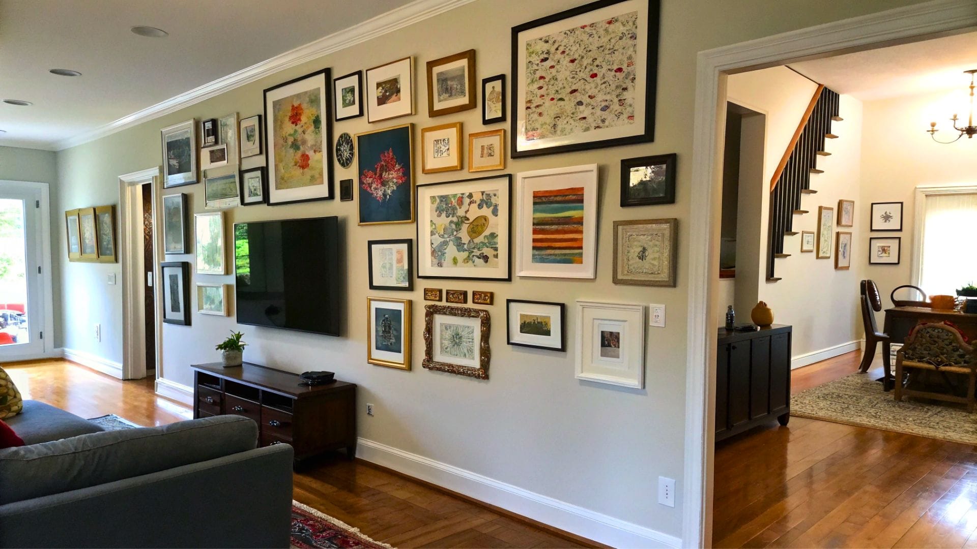
The Mistake: The biggest error I encounter in 90% of homes is improper spacing between artwork pieces. Most people either hang their pictures too far apart (creating a disconnected, floating effect) or too close together (making the wall feel cluttered and overwhelming). This single mistake can make even the most beautiful collection of art look unprofessional and visually jarring.
Why This Happens: Without proper guidance, homeowners typically eyeball the spacing, leading to inconsistent gaps that range anywhere from 1 inch to 6 inches between frames. This creates visual chaos because our eyes can’t find a rhythm or pattern to follow, making the entire wall feel uncomfortable to look at.
The Hidden Problem: Poor spacing doesn’t just affect aesthetics—it actually changes how we perceive the individual pieces. When artwork is spaced incorrectly, beautiful pieces can appear smaller, less important, or completely lost within the arrangement. Additionally, inconsistent spacing makes rooms feel smaller and less sophisticated, undermining your entire interior design scheme.
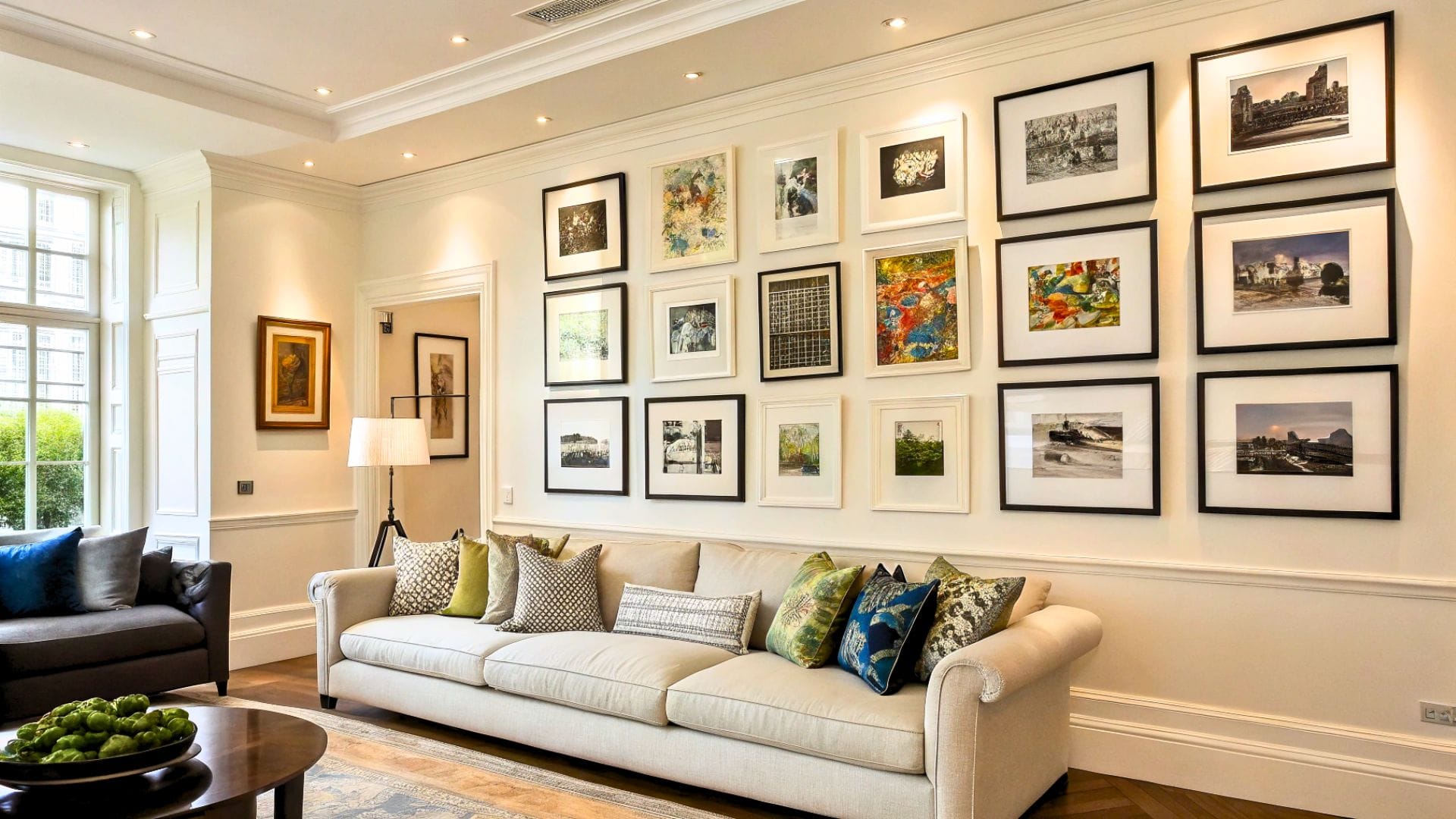
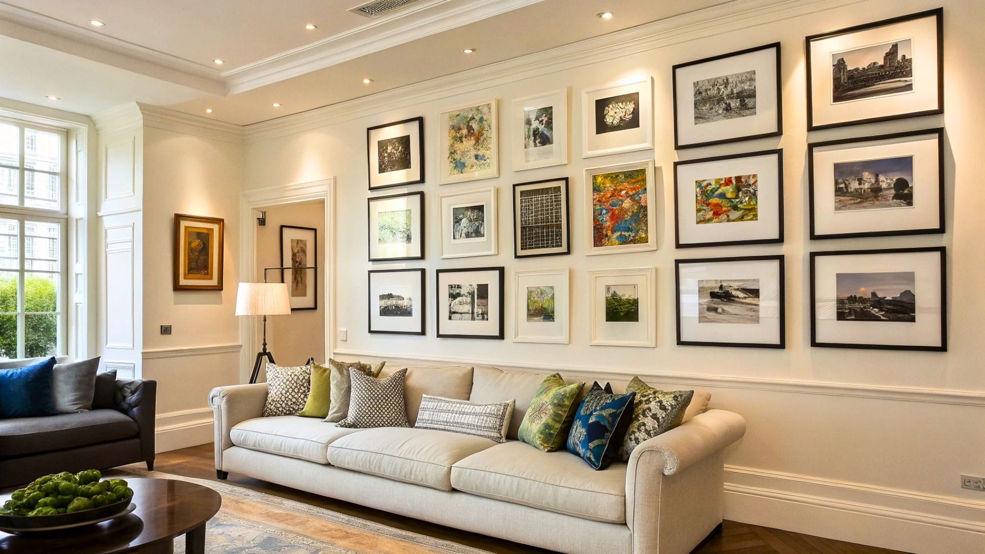
Real-World Impact: I’ve worked with clients who spent thousands of dollars on gorgeous artwork, only to have it look like a yard sale display because of spacing issues. One client’s living room featured stunning photography prints that looked cramped and chaotic until we applied the proper 2-3 inch spacing rule—suddenly, the same pieces transformed into a museum-quality display that became the room’s showstopper.
2. The Professional’s Blueprint: Creating Gallery Walls That Command Attention
The Solution: The secret to a stunning gallery wall lies in treating it as a single, unified composition rather than individual pieces hung randomly. Professional interior designers follow a systematic approach that ensures visual balance, proper proportions, and harmonious flow that guides the eye naturally across the display.
Step-by-Step Professional Process:
Planning Phase (The Foundation of Success):
- Cut paper templates matching each frame’s exact dimensions
- Lay templates on the floor to experiment with arrangements before making any holes in the wall
- Take photos of different layout options to compare and choose the most visually appealing composition
- Mark the wall’s center point and work outward to ensure balanced placement
The Golden Spacing Rule: Maintain 2-3 inches between all frames consistently. This distance is optimal because it’s close enough to create visual connection while providing sufficient breathing room for each piece to be appreciated individually. For larger walls or oversized pieces, you can extend this to 3-4 inches, but consistency is key.
Height and Alignment Strategy:
- Hang artwork so the center of each piece sits 57-60 inches from the floor (standard museum height)
- For galleries above furniture, maintain 6-8 inches between the furniture top and lowest artwork piece
- Create invisible alignment lines by matching edges, centers, or baselines across multiple pieces
- Use a laser level or smartphone app to ensure perfect horizontal alignment
Visual Balance Techniques:
- Distribute visual weight evenly by spreading larger, darker, or more colorful pieces throughout the arrangement
- Create an odd number of pieces when possible (3, 5, 7) as this naturally feels more balanced to the human eye
- Anchor the composition with your strongest or largest piece, then build around it
- Maintain consistent frame styles or color palettes to unify diverse artwork
The Professional Secret – The 5-Point Check: Before finalizing your gallery wall, step back and ask: (1) Does my eye move smoothly across the entire arrangement? (2) Is there consistent spacing throughout? (3) Do the pieces feel connected yet individual? (4) Is there balanced visual weight from left to right? (5) Does the bottom edge create a pleasing line when viewed from across the room?
Advanced Pro Tips:
- Create themed sections within larger gallery walls (family photos in one area, abstract art in another)
- Include one unexpected element like a small mirror or decorative object to add visual interest
- Consider the room’s lighting when positioning pieces—avoid placing glossy frames where they’ll create glare
- Leave room for growth; gallery walls should feel curated, not cramped
Transform Your Space Today
Creating a professionally designed gallery wall isn’t about having expensive artwork or perfect decorating skills—it’s about understanding and applying these fundamental principles that interior designers use every day. The transformation can be dramatic: clients often tell me their gallery wall became the first thing guests notice and compliment when entering their home.
Remember, your gallery wall should tell your story while enhancing your space’s overall aesthetic. By avoiding the spacing trap and following the professional blueprint outlined above, you’ll create a stunning focal point that reflects your personal style with sophisticated, designer-level appeal.
Start with these techniques on a smaller wall first to build confidence, then apply them to larger, more prominent spaces. Your walls—and your guests—will thank you for the professional touch that makes all the difference.
Look at this video — such simple tricks, yet it looks like such heavy work.
I will give credit to Serena Stadler for doing such smart work.
Final Thought;
The difference between a mediocre gallery wall and one that stops guests in their tracks isn’t talent or expensive artwork—it’s knowledge. Every homeowner has the potential to create magazine-worthy displays once they understand the fundamental principles that separate amateur attempts from professional results.
Your walls are blank canvases waiting to tell your unique story, and with proper spacing and strategic arrangement, even budget-friendly prints can look like museum-quality installations. Don’t let poor planning turn your beautiful art collection into visual clutter that diminishes your space’s potential. Take the time to measure, plan, and execute these proven techniques, because the impact on your home’s overall aesthetic will be transformative.
Remember, great interior design isn’t about perfection—it’s about intention and consistency in execution. Start with one small gallery wall using these principles, and you’ll quickly discover how this single change can elevate your entire room’s sophistication. Your home deserves the same attention to detail that professional designers bring to high-end spaces.